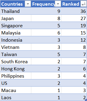
Recently I saw some Travel facts and figures for the Lunar New Year 2023. The table for the Top Five Destinations (see above) was interesting but difficult to digest.
Would it be possible to summarise this? Would it be possible to make this table more comprehensible at a glance? It may mean turning this table into some form of a diagram. A network diagram or Sankey diagram would probably do the job.
But what if Excel was the only that I had? This would be challenging.
Converting Table Information into Data
Table above presents nominal data. There are a number of options to convert it into numerical data. Using Excel, it was easy to auto-calculate a count of the mentioned countries.
Frequency is the number of times the country is mentioned in the Table. A simple COUNTIF formula gave the results instantly.
The Ranked is a weighted preference of destination. I put an arbitrary weightage of 5, 4, .., 1 for Top 1, Top 2, ..., Top 5 in reverse order respectively. As an example, if Thailand was mentioned twice as Top 1 destination and once as Top 2 destination, its score would be 2 x 5 + 1 x 4 = 14.
Excel Chart: Map
As the data was countries, I assumed Excel Chart: Map would be effective.
As it turns out, this chart was quite hard to control. It pans out the map of the whole world. But this makes it hard to see details if a country is small. The chart does not allow you zoom to a particular region.
Excel Chart: 3D Map
Fortunately Excel has another map function called 3D Map. There are more features and zooming into a particular region is easier.
It warrants further investigation, but I wanted a simpler way to make the information comprehensible.
Excel Chart: 2D-Column and Histogram Charts
I looked to the 2D-Column and Histogram Charts. These were a lot helpful in presenting the information. Here I present the Ranked data in a Histogram Chart.
With this chart you can easily read that of the earlier mentioned countries, Thailand, Japan, Singapore, Malaysia and Indonesia are the Top 5 destinations.There is nothing wrong with the initial Table. But when all the information is put together, the competing messages becomes overwhelming and appears as noise.
The next time you wish to put forward a table, do consider what your readers would perceive it. Go make better charts in your DC-Den!


Comments
Post a Comment