Posts

Displaying Mathematical Equations

Image
When I wrote on implementing Standard Error formula using LAMBDA, I used  CodeCogs Equation Editor webservice. Since then I have been trying a few other solutions. I put together this table for comparison. Renderer Engine Input Output Format Strong Points CodeCogs WebService LaTeX Image WYSIWYG Equation Editor Katex JavaScript MathML, TeX, and AsciiMath HTML+CSS, SVG, or MathML Fast rendering unlike MathJax and AsciiMath MathJax JavaScript MathML, TeX, and AsciiMath HTML+CSS, SVG, or MathML Widest browser compatibility AsciiMath JavaScript AsciiMath HTML+CSS, SVG, or MathML Easy to write equations, format like Excel equations. Here are some examples of a Quadratic Equation Renderer Quadratic Equation Example

Formula Name Manager Limit: ~2084 Characters

Image
While trying to implement a LAMBDA function I found myself unable to paste my formula into the Formula Name Manager. My first thought was that the LAMBDA has a character limit. But further investigation showed it was related to the Formula Name Manager, specifically the Refers to: field. Also it is not  related to the Name or the Comment field. Tweaking my formula the maximum number of characters is about 2084. Whitespaces are counted. This includes carriage returns and tabs. So, when implementing LAMBDA with the Formula Name Manager, do remember to keep your formula as concise as possible, but don't be too sloppy with variable names and indentation. That said, go edit your LAMBDA in your DC-DEN! Update: The Comment:  field limit is 256 characters.

Descriptive Statistics summary with LAMBDA

Image
One function in Excel that I find useful is the Descriptive Statistics from the Analysis Toolpak Add-In. At a glance I see a summary of the sample data. However I also find it cumbersome to use. It requires you to add-in Analysis Toolpak - not loaded by default. I wonder why Microsoft choses not to pre-load in Excel even though it has been available since Excel 2000 (maybe even earlier?). It launches a dialog. Recently, this becomes an issue as it unavailable in Excel Web. It returns a static result, not an auto recalculating function, i.e. the result is not updated if and when the data is updated. Of the 3 reasons above, I find the last most annoying. While field/laboratory sample data does not change after collection, but input data from external sources can be changing frequently. Any report based on external sources would have to be painstakingly updated manually. So in this blog, I will create a Descriptive Statistics function with LAMBDA that would recalculate automatically just
Image
  Recently I saw some Travel facts and figures for the Lunar New Year 2023 . The table for the Top Five Destinations (see above) was interesting but difficult to digest. Would it be possible to summarise this? Would it be possible to make this table more comprehensible at a glance? It may mean turning this table into some form of a diagram. A network diagram or Sankey diagram would probably do the job. But what if Excel was the only that I had? This would be challenging. Converting Table Information into Data Table above presents nominal data. There are a number of options to convert it into numerical data. Using Excel, it was easy to auto-calculate a count of the mentioned countries. Frequency is the number of times the country is mentioned in the Table. A simple COUNTIF  formula gave the results instantly. The Ranked is a weighted preference of destination. I put an arbitrary weightage of 5, 4, .., 1 for Top 1, Top 2, ..., Top 5 in reverse order respectively. As an example, if Thai

Confidence Interval function with LAMBDA and Optional Parameters

Image
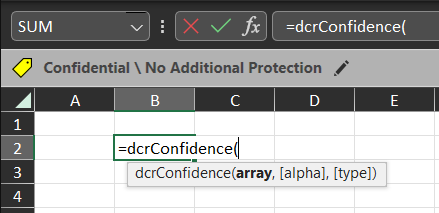
Excel provides CONFIDENCE.T  formula to calculate the confidence interval. This value, however, does not stand on its own. We usually want to know the upper and lower confidence limits as well.  In this blog, I will implement the calculation of upper and lower confidence intervals using LAMBDA. I will also demonstrate how to implement optional parameters, if a different significance level from the default 5% is required. But before that, I will introduce the LET function. LET Function The LET  function assigns names to calculation results. This is useful for storing intermediate results or values, or defining names inside a formula. The general syntax is as follows: =LET(name1, name_value1, [name2, name_value2,...], calculation) It supports up to 126 name-and-value pairs . The last parameter calculation is the return result of LET . Let's see this in action. Confidence Interval function I will create a new function  dcrConfidence  that takes an  array  and calculates the confi

Creating Table Arrays with LAMBDA

Image
Recap from the last blog, our intention is to build various custom statistical functions in Excel using the LAMBDA feature. This week I will create a Table Array using LAMBDA. Excel has VSTACK and HSTACK formulas to create Arrays. Combining these two functions we can build Tables Arrays. We will use Table Arrays to display statistical information. For a start I will create a simple About summary. Create a new formula with the following details: Name : dcrAbout Comments :  Returns a summary about dcRacoon Statistics. Refers To :  =LAMBDA(     HSTACK(       VSTACK(         "Author",         "Version",         "Last Update",         "Web"       ) ,       VSTACK(         "DC Racoon",         "0.1",         "21-Dec-2022",         "https://dc-den.blogspot.com"       )     ) ) The HSTACK creates a horizontal array (columns). And the VSTACK creates vertical arrays, the first being the items in each row, and the s

Better Charts

Image
Summary: December sale expected to stay above 60,000 units for the 5th consecutive month. A flattish  quarter-on-quarter in the 4th quarter is expected. Analysts forecast a lower sale in 2023. A recent news report showed a chart on vehicle sales. I reproduced the chart above and thought of improving it. As I am not an analyst in the transportation, I will refrain from making comments and stick only to improving the chart. At first glance, the chart is cluttered and it was hard to see where the story was getting at. I was also unconvinced with the 3 summary points to the right of the chart, as the graphs do not bring the points out. The first thing I did was declutter the chart by switching to line graphs instead. I kept the original author's intention to show a month-on-month view. I did not show the data points as it makes the chart untidy. I also reduced the vertical axis granularity. The covered range becomes clearer. To bring out the poin